
Jennifer Miller (Creative Director), Matt Lorenz (Art Director), and Alan Hyams (Senior Copywriter) have a collective 40 years of experience in direct mail. They sat down to discuss the thinking behind the direct mail packages they craft for TrueSense Marketing’s Salvation Army clients. This is part one of their three-part series.
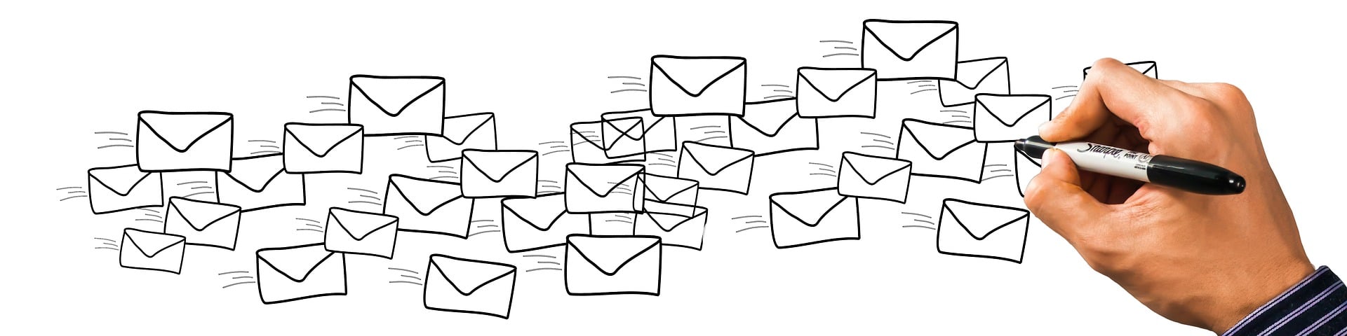
- Jen: Why don’t we start with the first thing people see when they get their mail, which is the outer envelope. With so many pieces of mail vying for attention, how do we stand out in the mailbox?
- Matt: The envelope is how you get donors into the package itself. If you can’t get it opened, then it doesn’t matter what’s on the inside.
- Jen: So, Alan, how do we get it opened? How do we get people inside the envelope? What copy do we use?
- Alan: The interesting thing is that there are different ways of getting it opened, and some of them are in complete opposition to each other. In some cases, there’s nothing more than an address. There is no copy. That creates intrigue, so that you have to open the envelope to see what’s inside.
- Jen: But other times, you want to broadcast something compelling and valuable, like a great offer. If you have a matching grant, you certainly want to call attention to that offer on the envelope.
- Matt: In direct mail, it’s not always about making the prettiest, most colorful envelope, either.
- Jen: Graphics and messaging certainly can and do work well on outer envelopes if they’re used strategically. That brings me to the importance of brand. Let’s talk about The Salvation Army’s brand and how well-recognized and well-trusted it is.
- Alan: I think one of our running jokes is that we’d like to test a mail appeal without any copy, just The Salvation Army logo, because The Salvation Army really is one of the top iconic brands for serving people in need. There’s enormous brand awareness, and there’s an enormous trust factor, too, that comes into play.
- Matt: It’s not just that they’ve earned the trust, it’s that they’ve maintained this trust for a century or more.
- Jen: If you’re getting something in the mail, and it’s got The Salvation Army shield on it, there’s recognition and trust right off the bat. But that doesn’t mean we want to lean only on brand. There’s so much art and science that goes into these direct mail appeals. So let’s talk about some of the science, like the importance of testing.
- Alan: Testing is the only way to prove a hypothesis beyond opinion or guesswork. It’s definitive.
- Matt: In marketing, you have to know your audience. How do we get to know how our audience responds? We test.
- Alan: The thing about testing, too, is that it gets us out of our own heads, and constantly reminds us that our personal opinion of whether we like something or not — that we’re writing or designing — is not the point. It has to work for a different audience than ourselves.
- Matt: The challenge for an outer envelope is: How do we get it to stand out, and how do we get it opened — all while remaining cost-effective?
- Jen: Well said. Now let’s go inside the direct mail package and discuss those components. We use different sizes of letters. Some are very short with a reply device attached. Some are much longer. When do we use longer versus shorter letters in our direct mail?
- Alan: Some of the most classic direct mail campaigns have been based on three-page, four-page, or even longer letters. Length can be based on what the offer is, what the campaign is about, or how much explanation it requires. It can be based on stories we use and how much real estate they need. If it’s a quick, urgent kind of appeal, you might be able to do a shorter letter than one requiring more explanation.
- Matt: Length of the letter is one factor. The design and readability are as important as length. I like to lean on a basic trio — what I call the three abilities: scanability, visibility, and readability.
Scanability is basically, people read from left to right, top to bottom. Your goal is to get what you’re trying to say in bolded text, underlined text, and call-outs throughout your story. The bolded, bigger things are read and scanned first.
Visibility is more about setting the stage of the text and trying to get it as clean as possible, allowing white space, or negative space. Clean, type font. Typography, after all, is a visual platform. It affects the perceptibility of a word, line, and paragraph in your letter.
Readability is beyond legibility, and more about how long each paragraph is, whether they’re indented sufficiently, etc. - Jen: Readability also plays into the word choices we use. Those really matter, because we’re not writing a book. We want to be economical with our words, but we want them to pack a punch. We always talk about the writing of these direct mail appeals as needing to be between the sixth and eighth grade level. Why is that?
- Matt: They shouldn’t have to work to decipher what we’re trying to tell them.
- Jen: And we want to really catch them emotionally, because that’s where we know people make decisions. You have to touch them through their hearts before they’ll ever reach for their wallets. To do that, we want to pick words that are going to move them, that feel easy and conversational. We want to make it easy for donors to move through a direct mail package so they’ll be moved to give. Let’s focus, while we’re still on the copy, on an important question. Why do we use the word YOU much more than the word WE in our letters?
- Alan: The we refers to the organization, and the you refers to the donor or a prospective donor who’s reading it. This appeals on a conscious level to the donor’s sense of self-satisfaction, worth, and what they’re doing.
- Matt: And it’s all about making the donor the hero. You can’t do that without mentioning them directly!